By Matthew Barstead, Ph.D. | November 29, 2018
I was recently interviewing for a job and a recruiter asked me if I wanted to enhance aspects of my machine learning background on my resume before she passed it on for the next round of reviews. I resisted the urge to chide her in the moment by pointing out the flawed distinction between statistics and machine learning, an unnecessary admonishment that would have been to no one’s benefit. The modal outcome would have been me sounding as if I was speaking with all of the arrogance, jackassery, and superiority that a recently minted Ph.D. could bring to bear in a social exchange. Not a good look when you are hunting for a job.
I bristle at the distinction between statistics and machine learning, in part, because, statistical modeling is on my resume. Links to statistical programs that I have created and to this very site are on there as well. References to published work with statistical models I have built and iterated through can also be found on the document. But, I make no overt statements about machine learning algorithms or their use in my work. I would be less annoyed if it were not the case that machine learning is just plain sexier than statistics these days. Machine learning is a buzz word that encapsulates all the amazing possibilities that exist for implementing cutting-edge, data-driven solutions to real-world problems. Statistics is the ugly cousin of machine learning that just so happens to make machine learning possible in the first place!
Some might argue that the Gaussian process models I work with are machine learning models (Rasmussen and Williams 2006). To me, they are mathematical expressions (i.e., models) that are used to explain a covariance matrix (sounds pretty statistics-y right?). I use a Bayesian estimation approach, in which a program, guided by certain rejection rules explores values of parameters until it converges on a likely distribution given the data and prior assumptions about the parameters (sounds sort of machine learning-y right?). I could have just as easily specified the same model in a maximum likelihood estimation framework, in which, the most likely estimates for the population values of the parameters would be determined given the data by minimizing the loglikelihood using a different sort of algorithm. If you fell asleep a little bit when reading those last two sentences, I don’t blame you. The point is that these models are statistical models and they are machine learning models. In the end, all statistical models have some sort of algorithm that guides decisions about parameter estimates and/or predicted values. The data go into the model, the machine (i.e., computer) identifies some set of likely parameter or predicted values based on the rules for the given model, and the end user gets a bunch of output they can use to make sense of the raw data fed into the program in the first place.
I am not the first person to struggle with the relevance of distinguishing between statistical models and machine learning models (Bzdok, Altman, and Krzywinksi 2018; O’Neil and Schutt 2014). Honestly, it seems to come down to a distinction between the terms commonly employed in a given field, with computer science and data science folks often preferring machine learning over statistical modeling (O’Neil and Schutt 2014). I do want to avoid being too glib, though, in my blurring of the lines between these two categories of data analysis, as there may be some value in separating the development of models to explain phenomena (statistical models) and the creation of data-based predictions about phenomena while remaining relatively agnostic about the underlying data-generating process (machine learning models). Statistical models, in theory, are more concerned with explaining the associations among the variables. Machine learning models just want to come as close as possible to accurately predicting an outcome.
So with this bubbling annoyance as my backdrop, I decided I should go ahead and apply different machine learning and statistical modeling approaches to a similar set of data problems. With the remainder of this post I plan to use publicly available data sets to walk through a few different implementations of statistical and machine learning models, comparing their outputs and touching briefly on meaningful differences and potential applications. I’ll briefly review implementations of k-means, k nearest neighbor, mixture modeling (latent profile analysis), discriminant analysis, naive Bayes classification, logistic regression, random forest, and a simple neural network.
I’ll be tackling the first three models/techniques in this post with future posts in this series tackling the remaining approaches.
K-Means
The k-means algorithm is often referred to as an unsupervised learning model. The algorithm allows users to specify k number of groups that maximally separate continuous data in (multi)dimensional space by minimizing within-cluster variance. Another way of thinking about this technique is that it classifies each case based on its total distance from a group mean or centroid (a multivariate mean). Like a lot of modeling approaches, k-means is finding a solution that minimizes an error term, in this case the within-group distance from a prototypical point (i.e., the mean).
Specifying the number of clusters, k, can be a little tricky, but there are some reasonable ways to do so. One is to use the “elbow” in a plot of the within-cluster sum of squares (WSS; a measure of within-cluster variance). At a certain number of clusters, the reduction in WSS begins to level out, suggesting you start to get lower explanatory returns for increased cluster complexity.
Using the iris data set, we’ll work through an example. The data set contains four measurements of plant anatomy: petal length, petal width, sepal length, and sepal width. These measures were collected on 50 specimens from three species for a total of 150 observations.
First we are going to load in the data, and then we will standardize the measures of plant anatomy so that all measures are on the same scale. I’ll be using a distribution with a mean of 0 and unit variance (i.e., \(\bar{y}=0, sd_y=1\)).
data("iris")
iris[,1:4]<-scale(iris[,1:4]) #standarizes columns of a matrix, default is mean = 0, sd = 1
psych::describe(iris)   #making sure I get the results I expect
## vars n mean sd median trimmed mad min max range skew
## Sepal.Length 1 150 0 1.00 -0.05 -0.04 1.25 -1.86 2.48 4.35 0.31
## Sepal.Width 2 150 0 1.00 -0.13 -0.03 1.02 -2.43 3.08 5.51 0.31
## Petal.Length 3 150 0 1.00 0.34 0.00 1.05 -1.56 1.78 3.34 -0.27
## Petal.Width 4 150 0 1.00 0.13 -0.02 1.36 -1.44 1.71 3.15 -0.10
## Species* 5 150 2 0.82 2.00 2.00 1.48 1.00 3.00 2.00 0.00
## kurtosis se
## Sepal.Length -0.61 0.08
## Sepal.Width 0.14 0.08
## Petal.Length -1.42 0.08
## Petal.Width -1.36 0.08
## Species* -1.52 0.07Now that I have the data standardized, it is time to run the k-means algorithm. Knowing that there are 3 species in here, I am going to iterate from 1 cluster to 6 clusters. I expect going into this analyis that the optimal solution, identified visually as the “elbow” in the plot below shoud be based on 3 clusters, given that there are in fact three species. Most use cases for k-means are situations in which a grouping variable is not known in advance. Note: The “elbow” approach is imperfect and other options exist for determining the number of clusters to specify.
wss <- (nrow(iris[,1:4])-1)*sum(apply(iris[,1:4],2,var))
for (i in 2:6) wss[i] <- sum(kmeans(iris[,1:4], centers=i)$withinss)
DF_kmeans<-data.frame(Cluster=1:6,
                      WSS=wss)
g1<-ggplot(data=DF_kmeans, aes(x=Cluster, y=WSS))+
  geom_point(size=3)+
  geom_line()+
  geom_hline(data=DF_kmeans,
             yintercept = (wss[3]+wss[4])/2,
             color='red',
             lty='dashed')+
  theme_bw()
## Warning: geom_hline(): Ignoring `data` because `yintercept` was provided.g1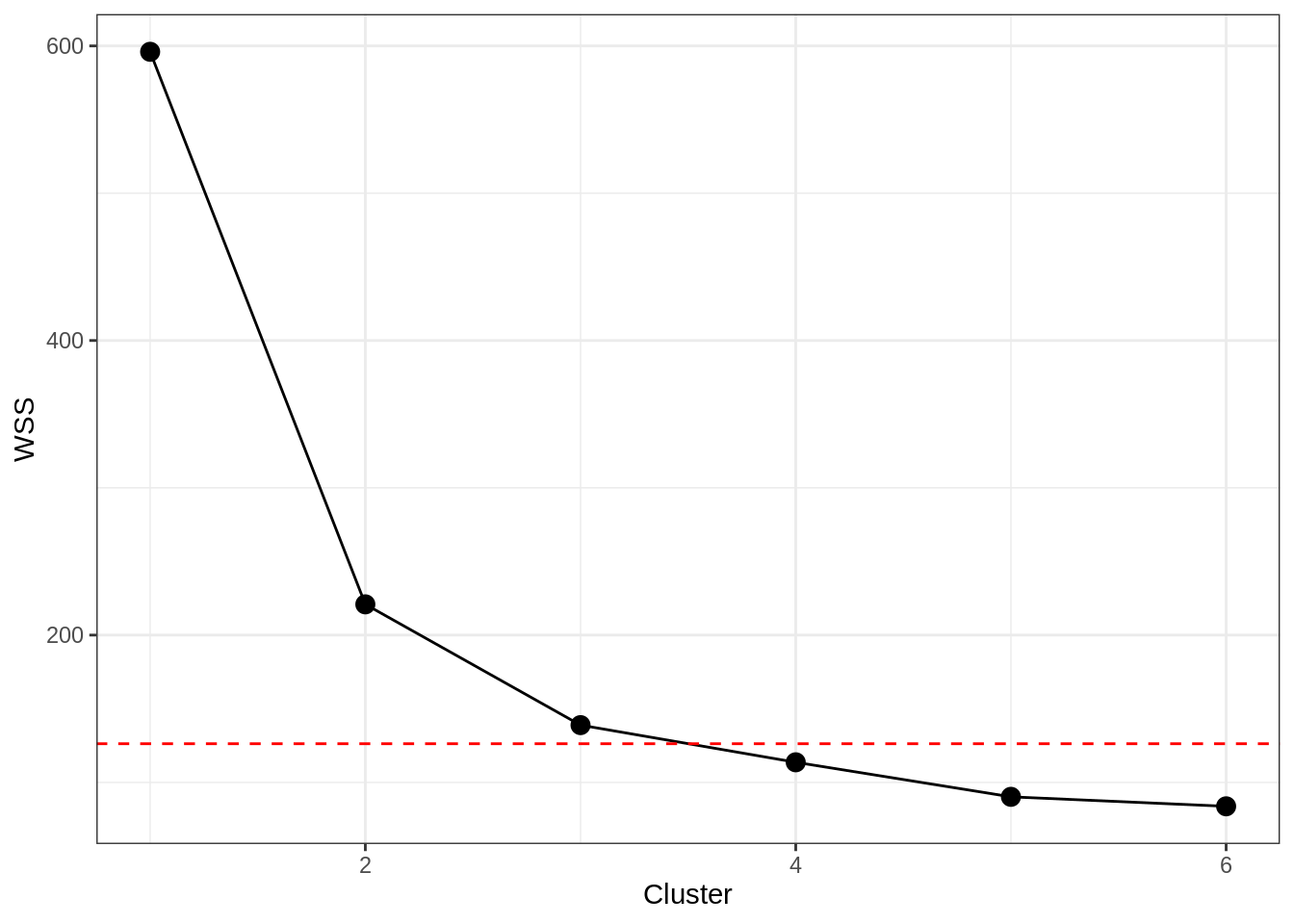
There is clearly a big dropoff from 1 to 2 clusters here, but we can really see that at 4 clusters the line starts to “flatten” out. Using a standard visual approach then, we would retain the number of clusters prior to the leveling out, which conforms to our expectations that 3 clusters should exist.
fit_kmeans <- kmeans(iris[,1:4], 3) #Saving the three-cluster solution
#Storing the cluster solution with the data
iris_kmeans <- data.frame(iris, fit_kmeans$cluster)
colnames(iris_kmeans)[length(iris_kmeans)]<-'Cluster'
tab<-table(iris_kmeans$Cluster, iris_kmeans$Species)
iris_kmeans$Cluster<-as.character(iris_kmeans$Cluster)
#need to adjust results (which will randomly assign cluster values) to align with corresponding species
iris_kmeans$Cluster[iris_kmeans$Cluster==rownames(tab)[tab[,2]==max(tab[,2])]]<-'Versicolor Cluster'
iris_kmeans$Cluster[iris_kmeans$Cluster==rownames(tab)[tab[,3]==max(tab[,3])]]<-'Virginica Cluster'
iris_kmeans$Cluster[iris_kmeans$Cluster==rownames(tab)[tab[,1]==max(tab[,1])]]<-'Setosa Cluster'
table(iris_kmeans$Cluster, iris_kmeans$Species)
##
## setosa versicolor virginica
## Setosa Cluster 50 0 0
## Versicolor Cluster 0 39 14
## Virginica Cluster 0 11 36We can see that the algorithm correctly clustered all of the setosa specimens, but had some difficulty differentiating bewteen the virginica and versicolor specimens. We can see this overlap when plotting the first two discriminant functions against one another.
plotcluster(iris[,1:4],fit_kmeans$cluster)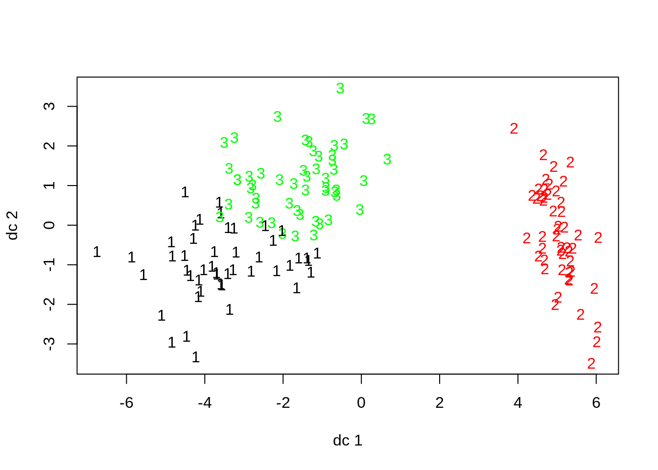
The raw data also indicate that veriscolor and virginica may be harder to disentangle from each other based on the available anatomical measures than they are to separate from setosa specimens.
g1<-ggplot(data=iris, aes(x=Sepal.Length, y=Sepal.Width, group=Species, color=Species))+
  geom_point()+
  stat_ellipse(alpha=.25)+
  theme_bw()

g2<-ggplot(data=iris, aes(x=Sepal.Length, y=Petal.Length, group=Species, color=Species))+
  geom_point()+
  stat_ellipse(alpha=.25)+
  theme_bw()

g3<-ggplot(data=iris, aes(x=Sepal.Length, y=Petal.Width, group=Species, color=Species))+
  geom_point()+
  stat_ellipse(alpha=.25)+
  theme_bw()

g4<-ggplot(data=iris, aes(x=Sepal.Width, y=Petal.Width, group=Species, color=Species))+
  geom_point()+
  stat_ellipse(alpha=.25)+
  theme_bw()

g5<-ggplot(data=iris, aes(x=Sepal.Width, y=Petal.Length, group=Species, color=Species))+
  geom_point()+
  stat_ellipse(alpha=.25)+
  theme_bw()

g6<-ggplot(data=iris, aes(x=Petal.Length, y=Petal.Width, group=Species, color=Species))+
  geom_point()+
  stat_ellipse(alpha=.25)+
  theme_bw()

cowplot::plot_grid(g1, g2, g3, g4, g5, g6, nrow=3)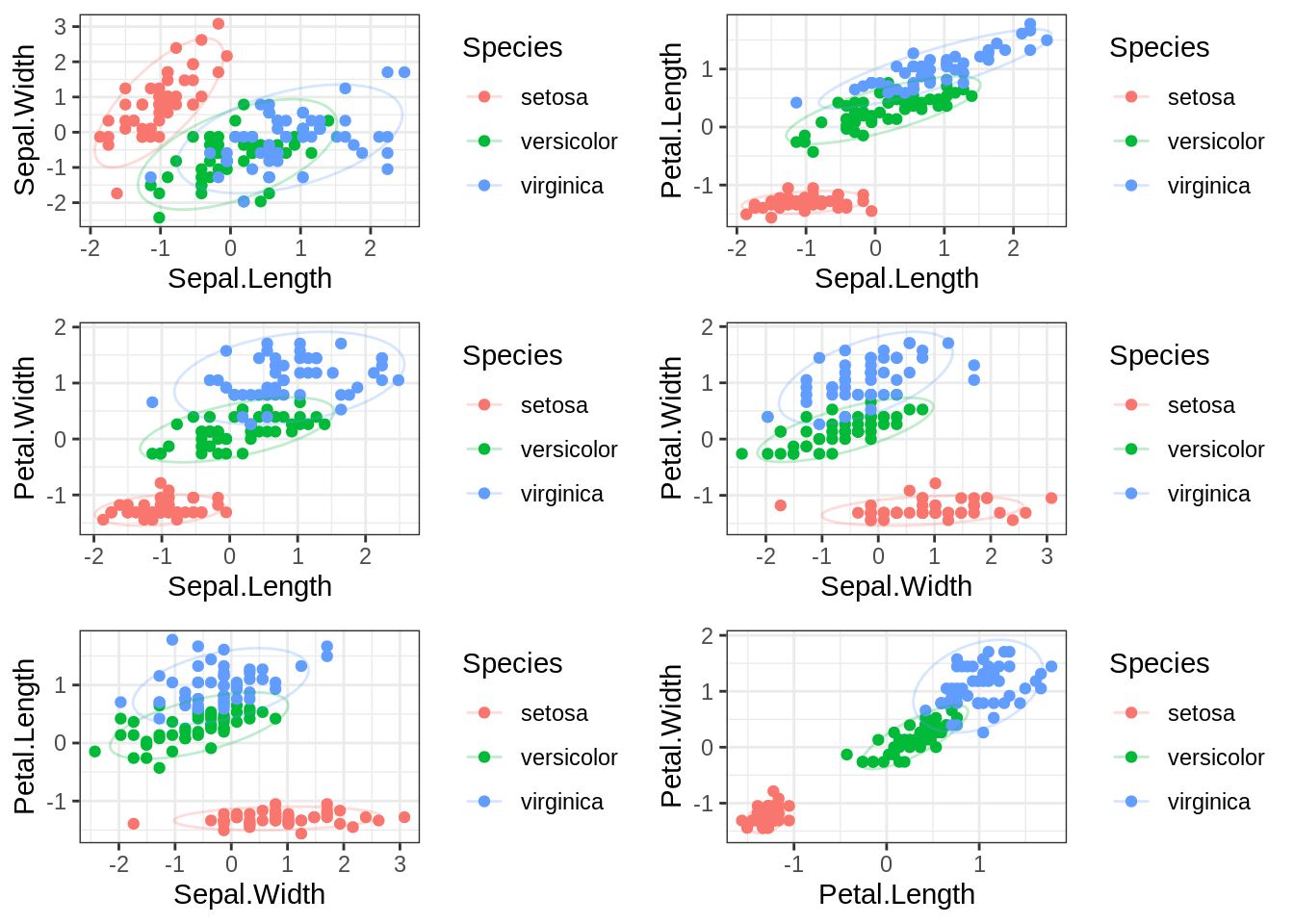
At least in bivariate space, it really seems as though setosa is very different than the other two specimens on these different measures of plant anatomy.
To close, it is worth highlighting that k-means can be used to identify clusters within observed data, based on minimizing distances from cluster means. There are no coefficients or weights produced by this model, so it cannot make predictions. Absent foreknowledge of the exiting groupings, it is impossible to evaluate its performance relative to a meaningful benchmark. It is a good exploratory technique and can have value as a pre-processing step in many situations, but beyond that, other methods will have to be used.
K Nearest Neighbor
The k nearest neighbor (often abbreviated as knn) algorithm is conceptually similar to the k-means approach, but operates more on a case-by-case basis. For each observation in the dataset, the algorithm finds a subset of the most similar cases in terms of squared distance (again a way of minimizing differences/errors/residuals, whatever term you like the best) from the target case. The number of cases used is set by k. Then, the nearest of the k neighbors is used to predict the classification of the target observation.
As opposed to k-means, knn can be used to predict classification based on new data, by finding k neighbors and using the nearest neighbor to classify the new case. The trick here is finding the optimal k for classification, which is going to vary from data set to data set. We can use a cross-validation approach though to identify the optimal k. I am using the train function from the caret package in R to perform this analysis. So for those following along at home, you’ll have to make sure you have caret and its dependencies installed.
fit_knn<-train(Species~.,
               data = iris,
               method='knn',
               trControl = trainControl(method='repeatedcv',
                                        number = 15,
                                        repeats = 50,
                                        classProbs = TRUE,
                                        summaryFunction = multiClassSummary),
               metric = 'AUC',
               tuneLength = 10)
## Warning in nominalTrainWorkflow(x = x, y = y, wts = weights, info = trainInfo, :
## There were missing values in resampled performance measures.plot(fit_knn)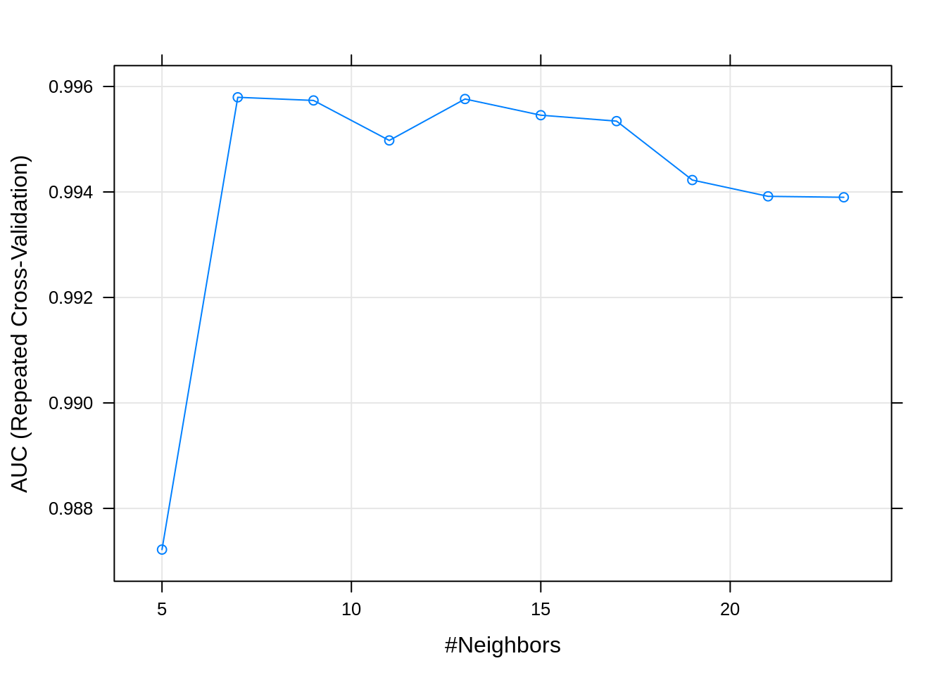
So if we look at this plot, we see that the area under the curve (AUC) is highest at k=9 (values for AUC closer to 1 represent a better performing knn model). Other relevant performance statistics can be viewed by simply running fit_knn in your console.
Next, we will want to see how the model performed in predicting the data. As an aside, with larger datasets it is possible to mitigate against overfitting by holding out a proportion of the data for testing model performance. My goal in this post is to compare the performance of statistical vs. machine learning techniques in correctly identifying patterns in the underlying data. As such, I will be keeping the entire iris data set intact so that supervised and unsupervised models can be evaluated on similar grounds.
pred<-predict(fit_knn)
table(pred, iris$Species)
##
## pred setosa versicolor virginica
## setosa 50 0 0
## versicolor 0 48 3
## virginica 0 2 47Compared to the k-means approach, we can see that the knn model, using 9 nearest neighborhoods, performs relatively well at separating versicolor and virginica specimens. Recall that k-means struggled making this distinction due to the two species’ overlap in distributions on several of the measures. A key added benefit of knn over k-means is that I can feed this model new data, and receive a species prediction, which is not possible with k-means.
#Note I chose values that are more consistent with the versicolor
newdata<-data.frame(Sepal.Length = .07,
                    Sepal.Width = -.95,
                    Petal.Length = .11,
                    Petal.Width =.59)

pred_new<-predict(fit_knn, newdata = newdata)
pred_new
## [1] versicolor
## Levels: setosa versicolor virginicaI can also get the estimated probability the new specimen included in the data frame above belongs to each of the groups. There are many reasons to want to consider group membership from models like these in a probabilistic fashion.
#Note I chose values that are more consistent with the versicolor
newdata<-data.frame(Sepal.Length = .07,
                    Sepal.Width = -.95,
                    Petal.Length = .11,
                    Petal.Width =.59)

pred_new<-predict(fit_knn, newdata = newdata, type='prob')
pred_new
## setosa versicolor virginica
## 1 0 1 0Mixture Modeling (Latent Profile Analysis)
Our departure into mixture modeling represents the first “full-blown” foray into a statistical model. I’ll start with the univariate case, as that tends to help people make sense of what a mixture model is trying to do. Taking a step back before displaying the univariate example it is worth asking, what value these models hold? Well, sometimes when researchers obtain a sample of observations, it is possible that they may have sampled multiple, separate populations. These populations in turn, have their own univariate (or multivariate) distributions on target scores of interest. Mixture models offer a means of both a) identifying the maximally likely number of populations (i.e., separate distributions that were sampled) and b) probabilistically determining each case’s membership in the sampled, but potentially unmeasured latent populations.
With that, welcome to the world of maximum likelihood estimation!! For you stats folks out there, you will recognize the approach I am using here is frequentist (the package I use relies on the Expectation-Maximization or EM algorithm). That is not to say that there are not Bayesian extensions of these sorts of models, though.
In a practical sense, there are two problems that a mixture modeling approach has to solve. The first is, estimating the appropriate number of latent classes or subgroups that best account for the observed distribution(s) of scores. This dilemma is similar to the problem facing an analyst using k-means to identify subgroups. However, there are a number of additional tools, beyond simply examining reductions in within-group sums of squares (WSS) the analyst can use to identify the optimal number of classes in a mixture modeling framework.
After negotiating this first step, the next challenge is to estimate the probability that a given case belongs to one class or the other. In a mixture model, the mean and the variances (and covariances in a multivariate classification problem) are used to create a posterior probability for each observed data point, and each case is then classified based on the highest probability observed for a particular group. So if there were three latent groups identified by the model, and the probabilities for a given case where .20, .38, and .42, the model would assign that case to group 3.
Below, as promised, is a simple demonstration of a “mixed” univariate distribution. Imagine that I measured a random sample of men and women on height. Let’s say that men in the population I sampled had an average height of 70 inches with a standard deviation of 4 inches (i.e., \(N\sim(\mu_M=70, \sigma_M=4)\)). By comparison, women in the population sampled had a mean height of 65 inches with a standard deviation of 3.5 inches (i.e., \(N\sim(\mu_F=65, \sigma_F=3.5)\)).
DF_mix_uni<-data.frame(Gender = c(rep('Male', 100),
                                  rep('Female',100)),
                       Height = c(rnorm(100, 70, 4),
                                  rnorm(100, 65,3.5))
                       )

g1<-ggplot()+
  geom_density(data=DF_mix_uni,
               aes(x=Height, fill='Overall', color='Overall'), alpha=.25)+
  geom_density(data = DF_mix_uni,
               aes(x=Height, group=Gender, fill=Gender, color=Gender), alpha=.25)+
  guides(color=FALSE)+
  scale_fill_discrete(name='')+
  theme_bw()
g1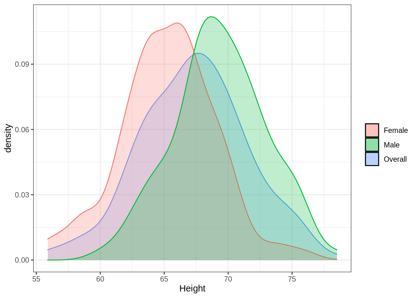
Using this plot, we can see how the two different distributions for men and women “average” out to the distribution for the overall sample. This of course becomes more complicated when we measure subgroups on mutliple dimensions and the distributions in question enter a multivariate space.
Still working with the iris data set, I’ll walk through a model-based clustering attempt to identify subpopulations of plant specimens given their anatomical measurements alone. As was the case with k-means, this effort at classification has no traditional depedent variable and is often considered an exploratory technique in statistical language or an unsupervised technique in machine learning speak.
The mclust package provides some nice built-in features for a problem like this, though as with many things in R, it is far from the only way to perform an analysis like this. First, I need to figure out the optimal number of latent classes I should extract in my final classification model. The mclust package allows the user to constrain certain properties of the multivariate distributions across groups to be equal in the model. Or alternatively, the analyst can choose to let these vary freely across possible groupings. Unless I have strong practical or theoretical reasons for assuming equivalency on these properties, I tend to the let all vary (i.e., I include 'VVV' in the model names). For illustrative purposes, I will have mclust default to showing model fit under all possible patterns of distributional constraints.
For step 1, I need a way to evaluate model fit somehow. Employing this modeling approach, I will actually end up weighing multiple sources of information in determining the optimal number of clusters, starting with Bayesian Information Criteria (BIC), which is a statsitic that can be used to compare multiple models. The BIC score penalizes models for added complexity that results in little improvement in the data-model fit. This feature helps ensure that more parsimonious models that perform well are chosen over more complex models with similar data-model fit. In the mclust formulation of BIC, values closer to 0 indicate better fit.
BIC<-mclust::mclustBIC(iris[,1:4])
plot(BIC)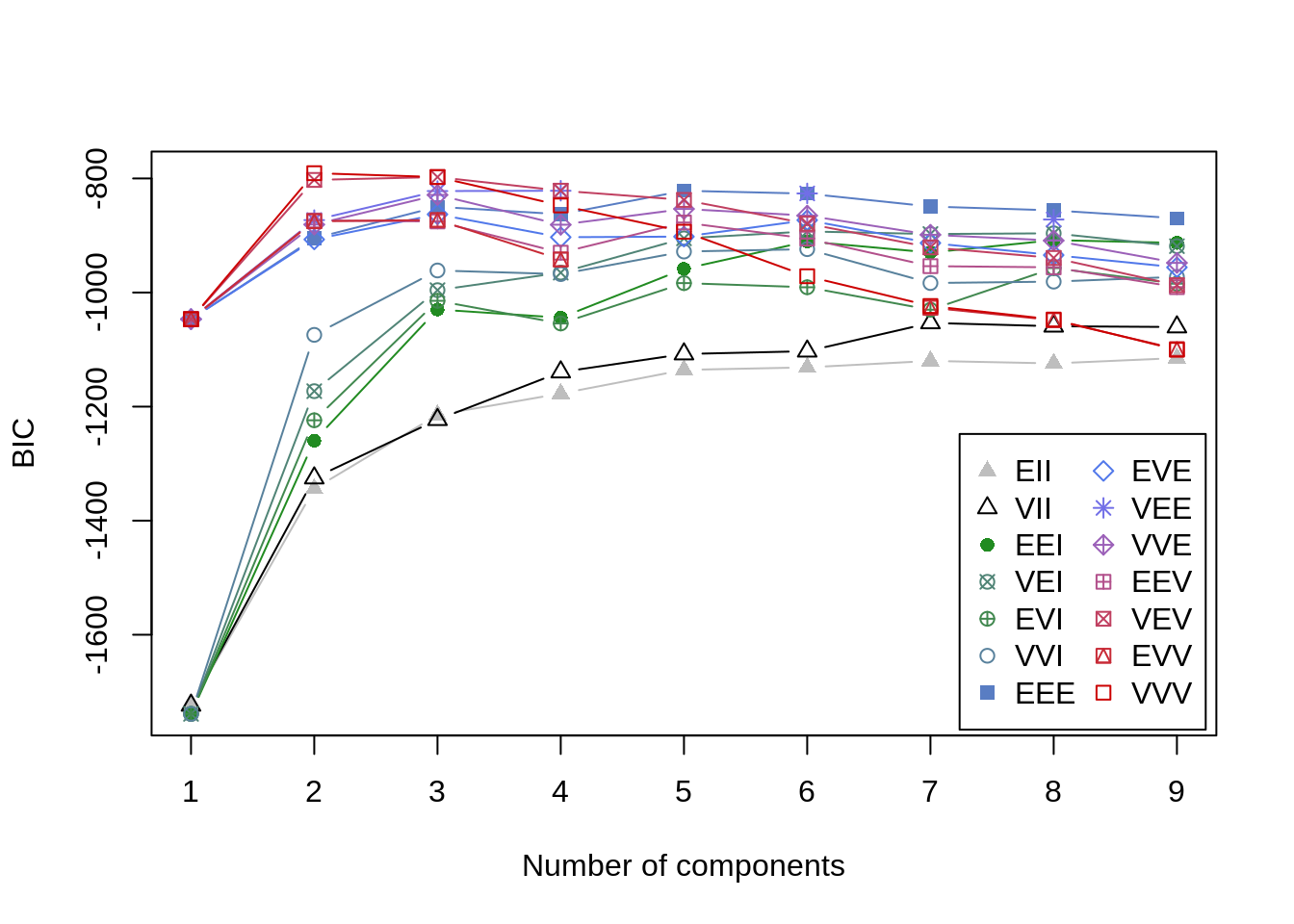
summary(BIC)## Best BIC values:
## VVV,2 VVV,3 VEV,3
## BIC -790.6956 -797.518958 -797.548282
## BIC diff 0.0000 -6.823349 -6.852673An alternative to BIC is the Integrated Complete-data Likelihood (ICL) criterion. It is also a measure of data-model fit, but it does not assume that the overall distribution is necessarily Gaussian (i.e., normal) (Baudry 2015). I understand this is getting a little technical, but the fact is that model-based clustering approaches are exploratory and require consideration of converging lines of evidence. The BIC value is based on some assumptions about the data that are not made with the ICL criterion. With k-means we only had to worry about minimizing WSS. With these more complex models, there are multiple ways of assessing the data-model fit as a function of the number of classes extracted. (Note you need to have the mclust loaded in the environment for the mclustICL function to work properly).
ICL<-mclust::mclustICL(data=iris[,1:4])
plot(ICL)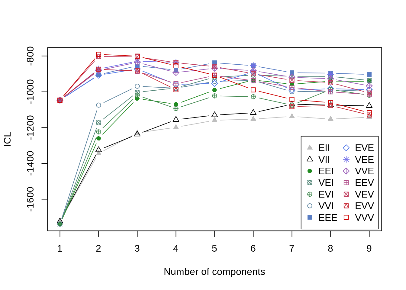
summary(ICL)## Best ICL values:
## VVV,2 VVV,3 VEV,2
## ICL -790.6969 -800.73908 -802.56763
## ICL diff 0.0000 -10.04221 -11.87076So far, the results are fairly similar across both measures of model fit I have used. Each indicate that the 2-class ‘VVV’ solution (distributional properties are free to vary across possible latent groups) is the best, simplest model for the observed data. It is worth noting that the difference between the VVV,2 and VVV,3 models is not all that large though. As a final step in determining the optimal number of latent groups, I will perform a bootstrapped likelihood ratio test. Without getting into the details, this technique tests whether inclusion of an additional class (i.e., \(k + 1\)) improves model fit above and beyond a simpler model (with \(k\) classes).
Note for high-dimensional datasets this could take a while.
LRT<-mclust::mclustBootstrapLRT(data=iris[,1:4], modelName = 'VVV', nboot=1000)
LRT
## -------------------------------------------------------------
## Bootstrap sequential LRT for the number of mixture components
## -------------------------------------------------------------
## Model = VVV
## Replications = 1000
## LRTS bootstrap p-value
## 1 vs 2 331.11985 0.000999001
## 2 vs 3 68.33618 0.000999001
## 3 vs 4 25.40075 0.689310689Okay so in reviewing these results, we see that the likelihood ratio test indicates that going from 1 to 2 classes improves model fit significantly (i.e, \(p < .05\), a commonly used cutoff). Going from 2 classes to 3 classes further improves model fit, but going from 3 classes to 4 classes does not.
The conclusion here, based on all of this exploratory work, is that we can go ahead and conclude that 3-classes is likely the optimal number to extract with no equality constraints placed on the multivariate distributions across groups.
fit_mix<-Mclust(iris[,1:4], G=3, modelNames = 'VVV')
summary(fit_mix, parameters=TRUE)
## ----------------------------------------------------
## Gaussian finite mixture model fitted by EM algorithm
## ----------------------------------------------------
##
## Mclust VVV (ellipsoidal, varying volume, shape, and orientation) model with 3
## components:
##
## log-likelihood n df BIC ICL
## -288.5255 150 44 -797.519 -800.7391
##
## Clustering table:
## 1 2 3
## 50 45 55
##
## Mixing probabilities:
## 1 2 3
## 0.3333333 0.2995796 0.3670871
##
## Means:
## [,1] [,2] [,3]
## Sepal.Length -1.0111914 0.08690767 0.8472868
## Sepal.Width 0.8504137 -0.64115633 -0.2489706
## Petal.Length -1.3006301 0.25163727 0.9756758
## Petal.Width -1.2507035 0.12842627 1.0308924
##
## Variances:
## [,,1]
## Sepal.Length Sepal.Width Petal.Length Petal.Width
## Sepal.Length 0.17757788 0.26939586 0.010964687 0.016039717
## Sepal.Width 0.26939586 0.74121713 0.014899264 0.027426477
## Petal.Length 0.01096469 0.01489926 0.009484392 0.004420409
## Petal.Width 0.01603972 0.02742648 0.004420409 0.018733017
## [,,2]
## Sepal.Length Sepal.Width Petal.Length Petal.Width
## Sepal.Length 0.40154260 0.2684011 0.1263996 0.08625955
## Sepal.Width 0.26840105 0.4875691 0.1184208 0.12941216
## Petal.Length 0.12639958 0.1184208 0.0644659 0.04540180
## Petal.Width 0.08625955 0.1294122 0.0454018 0.05516462
## [,,3]
## Sepal.Length Sepal.Width Petal.Length Petal.Width
## Sepal.Length 0.56449298 0.2554746 0.20706544 0.09739655
## Sepal.Width 0.25547457 0.5808469 0.10942673 0.16842603
## Petal.Length 0.20706544 0.1094267 0.10505359 0.05511877
## Petal.Width 0.09739655 0.1684260 0.05511877 0.14733331By including the parameters=TRUE argument, I can see the means and variances for each of the three clusters returned. The mclust package also has some nice exploratory features built in that can be used to evaluate the properties of the clusters:
plot(fit_mix, what='classification')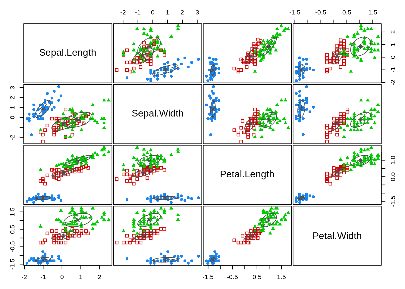
And, I can also compare the class results against the observed data (because this is something known in this instance - which may not always be the case when using a mixture model).
iris_mix<-data.frame(iris, fit_mix$classification)
colnames(iris_mix)[length(iris_mix)]<-'Classification'
iris_mix$Classification<-as.character(iris_mix$Classification)
table(iris_mix$Classification, iris_mix$Species)
##
## setosa versicolor virginica
## 1 50 0 0
## 2 0 45 0
## 3 0 5 50The model is slightly better in its overall classification than the knn approach (only 5 errors vs 6), and both performed better than the k-means algorithm.
To get a sense of why this approach is performing better it is helpful to visualize the data in multidimensional space. Click and manipulate the plot below to see how viewing the data in multiple dimensions makes it easier to detect the distinctions between groups.
plot_ly(data = iris,
        x = ~Sepal.Width,
        y = ~Sepal.Length,
        z = ~Petal.Length,
        type = "scatter3d",
        mode = "markers",
        color = ~Species)
This concludes the exploratory approach to classifying with this data set. However, the mclust package also allows for a more predictive modeling approach when there is a known class (as is the case in the present data set). You can even include priors (they have to be conjugate priors, which means that there are mathematical solutions to the resulting integrations - ignore if this makes no sense to you and stick with the defaults).
class<-iris$Species
fit_mix2<-MclustDA(data=iris[,1:4], class = class, modelNames = 'VVV')
summary(fit_mix2)
## ------------------------------------------------
## Gaussian finite mixture model for classification
## ------------------------------------------------
##
## MclustDA model summary:
##
## log-likelihood n df BIC
## -291.2597 150 42 -792.9662
##
## Classes n % Model G
## setosa 50 33.33 XXX 1
## versicolor 50 33.33 XXX 1
## virginica 50 33.33 XXX 1
##
## Training confusion matrix:
## Predicted
## Class setosa versicolor virginica
## setosa 50 0 0
## versicolor 0 48 2
## virginica 0 1 49
## Classification error = 0.02
## Brier score = 0.0116With this modeling approach we are now down to the smallest error rate so far, only three cases were mis-classified. What is more, this approach, as opposed to the exploratory results can be used to predict the classification of new data. It can also be used to evaluate a trained dataset on a new, observed data set to ameliorate problems with overfitting to an obtained sample (i.e., using a training/testing approach to model performance).
#Note I chose values that are more consistent with virginica
newdata<-data.frame(Sepal.Length = .75,
                    Sepal.Width = -.19,
                    Petal.Length = .76,
                    Petal.Width =.84)

pred_new<-predict(fit_mix2, newdata = newdata)
pred_new
## $classification
## [1] virginica
## Levels: setosa versicolor virginica
##
## $z
## setosa versicolor virginica
## [1,] 2.479729e-124 0.07448784 0.9255122So there you have it. Three models/techniques/algorithms that are all trying to accomplish similar classification/grouping tasks. The knn and the mixture modeling approaches clearly demonstrated the best performance in this, admittedly simple, toy problem of classifying plant specimens. The next installment will take a deeper dive into traditional discriminant analysis as well as Naive Bayes classifiers. The former are often considered to be a part of the statistical modeling family; the latter are more frequently used these days in the data science/machine learning world. Each, again end up doing very similar things.
References
Baudry, Jean-Patrick. 2015. “Estimation and Model Selection for Model-Based Clustering with the Conditional Classification Likelihood.” Electronic Journal of Statistics 9 (1). The Institute of Mathematical Statistics; the Bernoulli Society: 1041–77.
Bzdok, Danilo, Naomi Altman, and Martin Krzywinksi. 2018. “Statistics Versus Machine Learning.” Nature Methods 15: 233–34.
O’Neil, Cathy, and Rachel Schutt. 2014. Doing Data Science. O’Reilly Press.
Rasmussen, C.E., and K.I. Williams. 2006. Gaussian Processes for Machine Learning. The MIT Press.