By Matthew Barstead, Ph.D. | June 7, 2018
(Updated: 2020-12-31)
Problem Statement
Determine whether, given what we know about the target phenomenon, a sample of 120 subjects, measured at three time points is sufficient to detect linear change in an unconditional growth model.
A trained phlebotomist once described her experience trying to pierce a patient’s vein with her needle as akin to “Trying to use a toothpick to stick a wet noodle covered by a piece of wax paper.” I assume the cooking imagery was due to the fact that she was hungry at the time. I personally have very little experience initiating intravenous blood draws, but her description seemed apt for any hard-to-pin-down problem. You try one thing and the system reacts against your efforts in an unexpected way. You come at the problem from a different direction and the solution wiggles away again.
The problem statement above has a lot of potential wiggle to it, even if it sounds straightforward. For a little additional context, this walkthrough is the result of an ask from a senior researcher. He requested a “quick” power analysis for a linear growth model using data obtained from 120 subjects. Having already collected the data, the goal of the power analysis was to explore whether a sample of 120 subjects would be sufficient to detect significant linear change (\(\alpha = .05\)) for a secondary research question that was not part of the original proposal (we added collection of a set of variables partway through the data collection period).
We collected measures of these variables at three time points (start, middle, and end of an 8-week intervention). For the purposes of these analyses, I decided to treat the data as if they were collected at precisely the same equally spaced interval for all participants. Though this is not technically true, it is sufficiently true, and it simplifies the task somewhat. Modifying the code to take into account the actual difference in time between individual assessments is entirely possible and potentially important, just not in this case.
To create a reasonable population model, I needed to think through what I know about the treatment effects and the target population. For instance, we know that the data were obtained from a selected sample of children, who were eligible to participate if their scores on a measure of early childhood anxiety risk exceeded the 85th percentile.
We’ll use this and other information to guide decisions about the properties of our power analysis.
Defining a Data Generation Process
Our target phenomenon is individual variation in anxiety scores. We’ll make a simplifying assumption that our anxiety scores are normally distributed in the overall population with a mean of 0 and a standard deviation of 1.
\[ anxiety \sim N(0, 1) \\ selected \in [0, 1] \\ \]
As part of the initial screening, anyone whose standardized anxiety score is \(\leq 1\) gets added to the ineligible pile. Anyone whose score is above 1 can be selected for participation. In practice, we kept up recruitment efforts in the wider community until we hit our eligibility mark for a given cohort.
\[ \begin{Bmatrix} anxiety_i \leq 1, & selected_i = 0 \\ anxiety_i > 1, & selected_i = 1 \end{Bmatrix} \]
Enforcing Selection Criteria
We’ll start with the assumption that our sample selection process worked more or less as described above and that we captured the upper tail of a normal distribution.
Modeling Tip. We can formalize the rules that enforce our selection criteria and distributional assumptions by writing a custom function. Having a function perform this task saves us from having to copy and paste this chunk of code over and over again as we run our analyses. The
whileloop here can probably be simplified; however, the goal was to write this function in a way that maps directly onto the screening process described above. At these sample sizes and with the proposed threshhold we don’t pay too much of a computational cost for ourwhile, but that may not always be the case. That being said even when not trying to make certain mappings explicit, my general approach is to worry about getting the code to work as expected first. Optimization is a secondary problem.
#' Returns a sample selected from upper tail of a normal distribution, beyond a specified cut point
generate_upper_tail_sample <- function(mu, sd, n, cut_point) {
  i <- 0
  n_rejected <- 0
  y_vals <- c()

  while(i < n){
    y_i <- rnorm(1, mu, sd)

    if(y_i > 1) {
      y_vals <- c(y_vals, y_i)
      i <- i + 1
    }
    else {
      n_rejected <- n_rejected + 1
    }
  }

  return(list(
    y = y_vals,
    n_sample = i,
    n_rejected = n_rejected
  ))
}
Let’s make sure generate_upper_tail_sample works. First, we generate some simulated values.
MU <- 0         # population mean
SD <- 1         # population standard deviation
N <- 120        # target sample size
CUT <- 1        # cut point - above which the target sub-population exists

anx_scores <- generate_upper_tail_sample(MU, SD, N, CUT)
Then we plot.
ggplot() +
  geom_histogram(aes(x = anx_scores[['y']]), fill = '#426EBD', bins = 8) +
  labs(x = 'Standardized Anxiety Score', y='Frequency',
       caption = 'Figure 1. Histogram of anxiety values returned from generate_upper_tail_sample()') +
  theme_bw()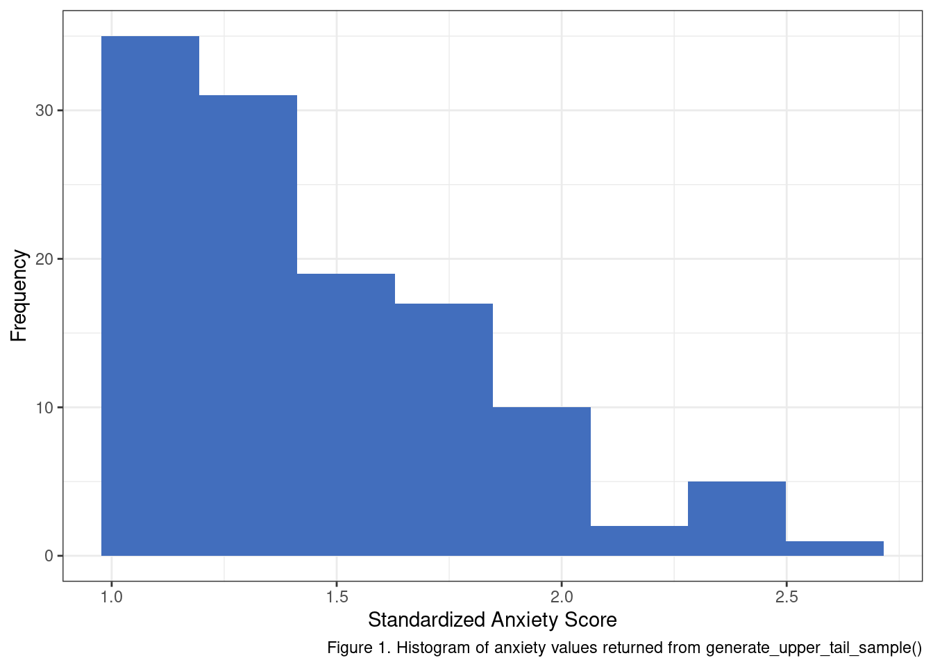
My little helper function seems to be working. One aspect that should stand out at this point is that if we apply a cut point to select a target sample from a normal distribution in this fashion - we should not expect a normal distribution of scores in the sub-population. To make this fact more obvious let’s generate more samples using generate_upper_tail_sample and inspect their posterior distributions.
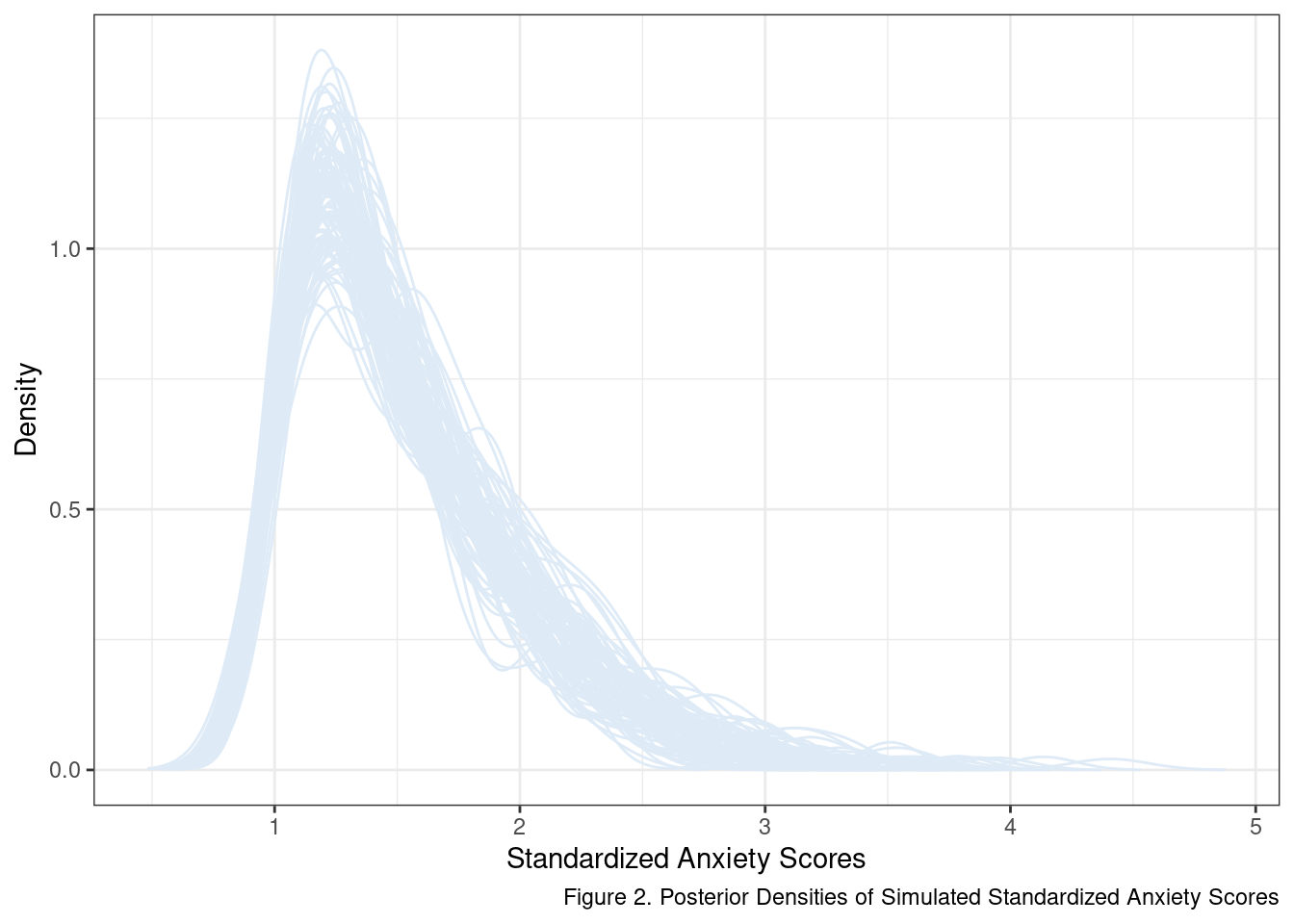
The kernel used to smooth out and calculate the density function makes it seem like there are values below 1. There aren’t, at least not in our sample at this point. In fact, a score of 1 is a known, lower limit given our selection criteria. This effect of extending beyond observed data is a consequence of the default settings used by the density() function. The more important takeaway is that anxiety scores in this target population probably follow something closer to a lognormal distribution than a normal distribution.
This is just one theory of the case for the data generation process of our baseline scores. In reality, screening took place weeks in advance of the baseline measure of anxiety used as the anchor point for assessing treatment effectiveness. Should this fact have consequences for our distribution of scores at the start of the intervention? The short answer is yes. The details on how I go about defining the data generation process for the time 1 anxiety scores are covered in the “Deeper Dive: Reliably Measured with Error” box below.
As an aside, this is a good example of a wiggly point in this particular power analysis. It is a byproduct of using the same measure to screen participants that we later use to assess change in response to the intervention. Most power analyses have some idiosyncratic design choice or measurement property that requires a bit of additional thought. In this case, it is attempting to include what we know about the selection process in the data simulation. It is extra work to be sure, but the payoff is that we get a reasonably principled means of generating our time 1 scores.
Deeper Dive: Reliably Measured with Error
Just about every metric used in the social sciences is measured with some error. Part of the problem is that there is no physical entity we can use to measure someone’s openness, kindness, or anxiety. There are measures and methods that generate values that we think correspond to these and other target phenomena, but, if pushed, we usually have implicitly accepted that our observed values are a mix of variation attributable to the characteristic or trait we hope to measure and any number of (what we hope are) random sources of “noise” or “error”.
More formally:
\[ y_{obs} = y_{true} + y_{error} \]
There are a few ways to evaluate how much error variance our scores might contain. In our case, we’ll use a simulated term that can leverage reported reliability coefficients. If we don’t have confidence in extending reported reliabilities to our target population for a given measure (e.g., the populations may differ too much), we can instead set a minimum threshold or use an upper and lower bound to represent “best” and “worst” case scenarios.
To be a little extra obnoxious, assume that we also want to maintain the standardized scale for the observed scores. So how do we build all of these rules into the simulation? Let’s start by writing them out:
- The observed scores used to determine eligibility are measured with error.
- The observed scores are normally distributed with a mean of 0 and a standard deviation of 1.
- Both the “true” and “error” values are normally distributed.
So in order for all of these conditions to be true, we assume the following:
\[ \sigma_{obs}^2 = \sigma_{true}^2 + \sigma_{error}^2 \\ \]
and leveraging what we know about the connection between Pearson’s correlation and \(R^2\) in a linear Gaussian regression model we also expect the following to be true:
\[ R^2 = \frac{\sigma_{true}^2}{\sigma_{true}^2 + \sigma_{error}^2} \]
where we are conceptualizing \(R^2\) as the proportion of variance in \(y_{obs}\) accounted for by “true” variation in the target phenomenon. And now to convert that knowledge into something that can map onto to a correlation scale:
\[ r = \pm \sqrt{R^2} \\ r = \pm \sqrt{\frac{\sigma_{true}^2}{\sigma_{true}^2 + \sigma_{error}^2}} \]
Now all we need to do is distill this information down to two sets of equations with only two unknowns. Then we can substitute and solve for the error variance. To make this work, we’ll need to fix two values: the correlation between observed and true scores and the variance of observed values. For the former, we’ll assume a correlation of .775 and for the latter, we’ll fix our observed score variance to 1. Dropping in these values we get the following:
\[ \sigma_{obs}^2 = 1 \\ \sigma_{obs}^2 = \sigma_{true}^2 + \sigma_{error}^2 \\ 1 = \sigma_{true}^2 + \sigma_{error}^2 \\ \]
And then we start on the \(r\) side of things.
\[ r = \sqrt{\frac{\sigma_{true}^2}{1}} \\ .775 = \sqrt{\frac{\sigma_{true}^2}{1}} \\ .775^2 = \sigma_{true}^2 \\ .775 = \sigma_{true} \]
So the standard deviation of the “true” source of variation in our data generation process is .775. This happens to be the direct result of fixing variance in our observed scores to be equal to 1. Now for the error distribution’s standard deviation, we just need to plug our value for \(\sigma_{true}^2\) back into the first equation.
\[ 1 = \sigma_{true}^2 + \sigma_{error}^2 \\ 1 = .775^2 + \sigma_{error}^2 \\ \sigma_{error}^2 = 1 - .775^2 \\ \sqrt{\sigma_{error}^2} = \sqrt{1 - .775^2} \\ \sigma_{error} = .632 \]
Now how do we bake this into our simulation? By modifying our generate_upper_tail_sample function slightly… :
#' Returns a sample selected from upper tail of a normal distribution, beyond a specified cut point
generate_upper_tail_sample <- function(mu, sd, n, cut_point, rel_est = .75) {
  i <- 0
  n_rejected <- 0
  y_vals <- c()

  sd_error <- sqrt(1 - rel_est^2)

  while(i < n){
    y_true <- rnorm(1, sd = rel_est)
    y_error <- rnorm(1, sd = sd_error)

    if(y_true > rel_est) {
      y_obs <- y_true + y_error
      y_vals <- c(y_vals, y_obs)
      i <- i + 1
    }
    else {
      n_rejected <- n_rejected + 1
    }
  }

  return(list(
    y = y_vals,
    n_sample = i,
    n_rejected = n_rejected
  ))
}
Pay special attention to the addition of the rel_est parameter, our estimate of reliability. We can see the consequences of this new implementation by generating and plotting the distributions of 100 new samples.
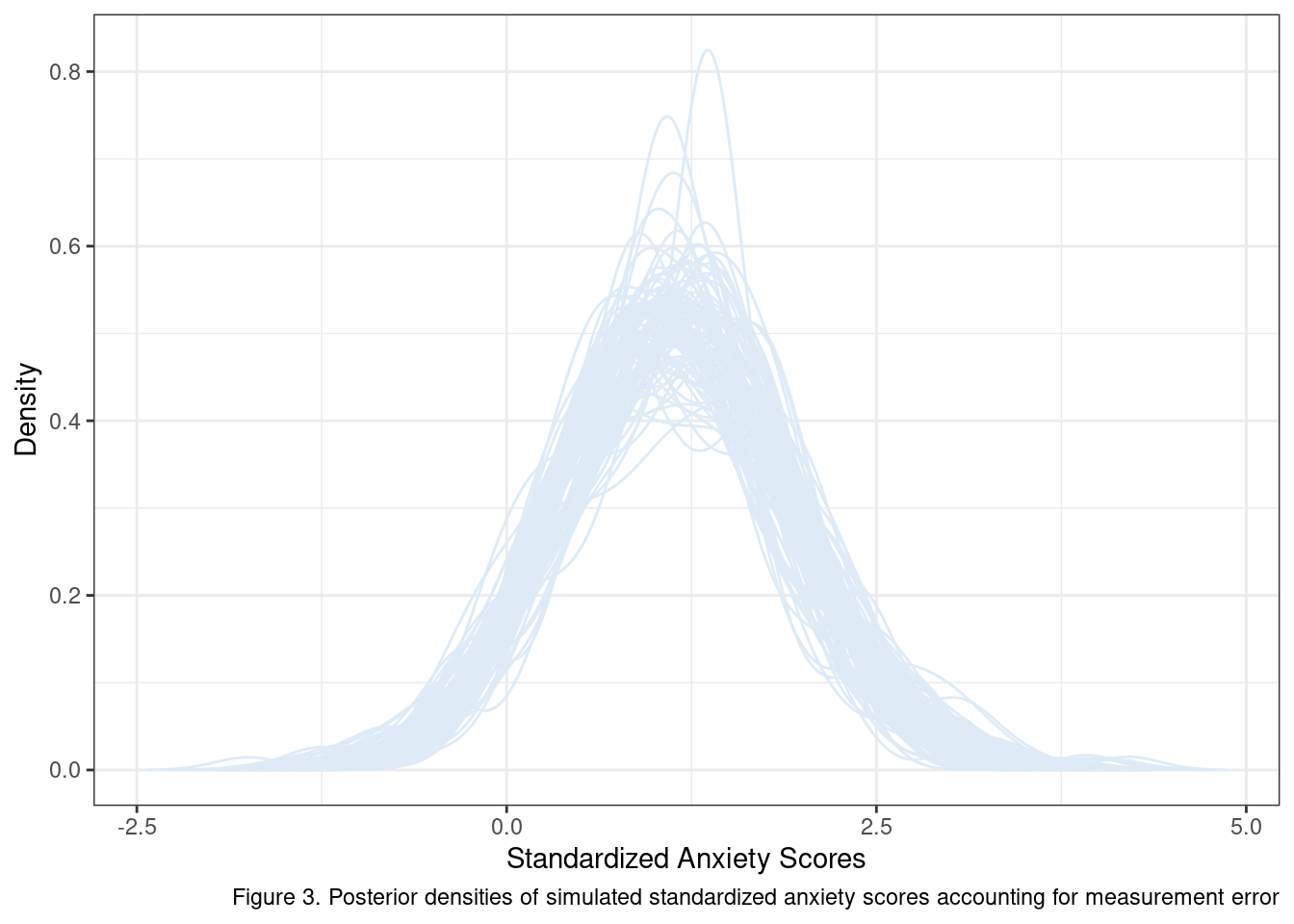
Well what do you know? Maybe we should not expect our initial scores to have a lognormal distribution after all. If our target sample is a sub-population whose true anxiety is \(> \mu_{y} + \sigma_y\) the best we may be able to do with a measure that is correlated with true variation in anxiety at \(.775\) is a mostly symmetrical distribution with a mean a bit above 1.
Why go through this extra work? For one it makes us think more intensively about our research design and its implied consequences given what we know about our target sample and available measures. More importantly, it provides a means of embedding what we know about our data and design into the power analysis itself. As this exercise has shown, even relatively simple selection criteria can have meaningful consequences on observed distributions, conditioned on the error variance present in the measure.
Simple Unconditional Growth Model
All of the work up to this point was to figure out a way to generate scores for our simulated participants right before the start of the intervention. Now it is time to dig into the rest of the proposed linear change model.
Taking a step back, we think that there is some average linear model that will maximally explain individual change in standardized anxiety scores as a function of time. Sounds like any other regression model, and it sort of looks like one too. So why the fancy “unconditional growth model” term?
Growth models or growth curves are often used in longitudinal designs to assess factors that influence individuals’ change over time. These models are a special subset of the more general multilevel modeling family.
\[ Anxiety_{ti} = \pi_{0i} + \pi_{1i}(Time_{ti}) + e_{ti} \] What makes this a “multilevel” model is the fact that we are modeling both population-level change and individual level change at the same time. We achieve this end by specifying a second set of equations that define individual’s deviation from the population-level regression line:
\[ \pi_{0i} = \beta_{00} + r_{0i} \\ \pi_{1i} = \beta_{10} + r_{1i} \]
Each of these “second-level” equations introduces a new pair of terms. In this unconditional model, \(\beta\)’s represent the best estimate of the population regression line. The \(r\)’s represent individual deviations from those population parameters. When combined, the \(\beta\)’s and \(r\)’s give rise to the \(\pi\)’s in the first equation - which can now be different for each individual in our data set.
Now that we know the model, it is time to think through our options for assigning values to its various parameters. Note that we have already created a data generation process for individual intercepts above. So next, let’s assign the amount of change we expect per unit of time (\(\beta_{10}\)). Given the short nature of the intervention, a change of .05 standardized units in anxiety per unit of time would be at the lower end of our expectations, and a change of .15 standardized units per unit of time would be at the high end. Over three time points and extrapolating from the linear model (fancy phrasing for multiplying by 2), our overall change expectations would be .10 standardized units or .30 standardized units, respectively.
We’ll start with some absurd priors for our error terms (the \(e\) and the \(r\)’s) and evaluate just how nonsensical they are by depicting the implied results graphically.
pi_0i <- generate_upper_tail_sample(MU, SD, N, CUT, rel_est = .775)[['y']]
time <- 0:2
beta_10_lb <- -.05
beta_10_ub <- -.15
sigma_e <- 1.5
sigma_r1 <- 2

sim_df <- data.frame()
for(n in 1:N){
  e_ti <- rnorm(length(time), sd = sigma_e)
  r_1i <- rnorm(1, sd = sigma_r1)

  y_obs_lb <- pi_0i[n] + (beta_10_lb + r_1i) * time + e_ti
  y_obs_ub <- pi_0i[n] + (beta_10_ub + r_1i) * time + e_ti

  tmp_df <- data.frame(
    anx_scores = c(y_obs_lb, y_obs_ub),
    time = rep(time, 2),
    id = n,
    scenario = c(rep('LB', length(time)), rep('UB', length(time)))
  )

  sim_df <- rbind(sim_df, tmp_df)
}
Before looking at the plots let’s break down the effect these error terms have. Changing the error variance for \(e\) adjusts the degree to which observed data will vary from each individual regression line. The upshot is that higher values mean larger swings from time point to time point for each individual. When we modify the \(r_1\) variance we are changing the between-subjects differences in average change. Larger values mean that individual trajectories can deviate more from the population estimate. In practice, this means a wider range of steeper slopes is possible. Let’s compare these two scenarios by randomly selecting 30 observations that were simulated under these conditions.
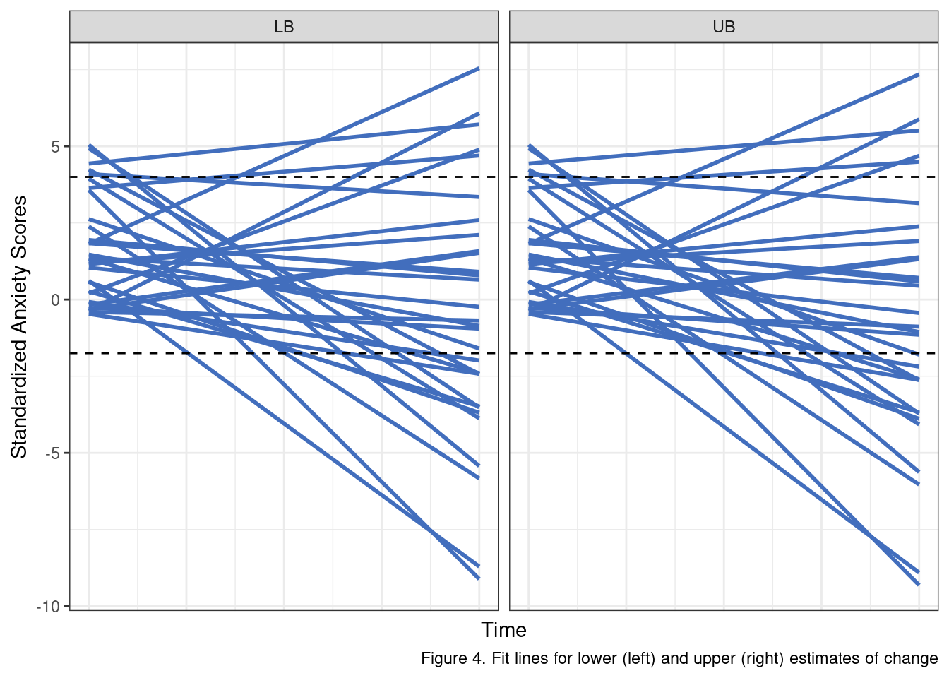
A few things are important to recall here. Our study design expects a sample that is, on average, elevated in anxiety scores. We are not able to perfectly capture individual’s anxiety scores but our measure and selection criteria should reliably yield a sample that is elevated in standardized anxiety scores at the start of the intervention period (when \(Time_{ti} = 0\)), and that fact appears to be suitably reflected in our simulation approach (most lines start above 0).
We also know that the scores are standardized with unit variance, and we have some sense of what an effect would look like at the low (net change of .10) and high end (a net change of .30).
The black lines in Figure 4 represent a rough estimate of a reasonable range of values for these scores given all of the information we have covered to this point. As we can see, numerous individual fit lines lines extend well beyond these thresholds. More to the point, on a standardized scale, this model, with these error terms, allows for some individuals to change by almost 8 standardized units!
When we look at the simulated raw scores instead of the fitted lines, the problem is even more obvious. Some participants fluctuate up to 6 or 7 standardized units between consecutive assessments. These results simply do not make sense given what we know about the data.
sim_df %>%
  filter(id %in% sample(ids, size = 30)) %>%
  ggplot(aes(x = time, y = anx_scores, group = id)) +
  geom_line(alpha = .45, color = '#426EBD') +
  facet_wrap(.~scenario) +
  labs(x = 'Time', y = 'Standardized Anxiety Scores',
       caption = 'Figure 5. "Raw" lines for lower (left) and upper (right) estimates of change') +
  theme_bw() +
  theme(axis.text.x = element_blank(),
        axis.ticks.x = element_blank())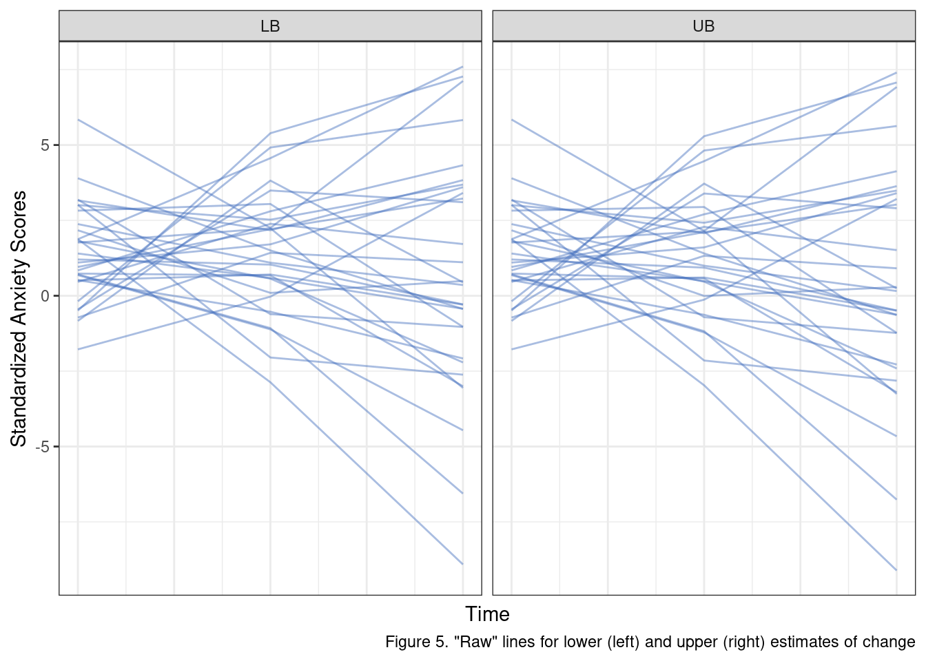
So if these are “bad” priors for the simulation, what do better ones look like? After some testing I settled on the following values which I think offer fairly reasonable-looking posteriors.
pi_0i <- generate_upper_tail_sample(MU, SD, N, CUT, rel_est = .775)[['y']]
time <- 0:2
beta_10_lb <- -.05
beta_10_ub <- -.15
sigma_e <- 0.33
sigma_r1 <- 0.67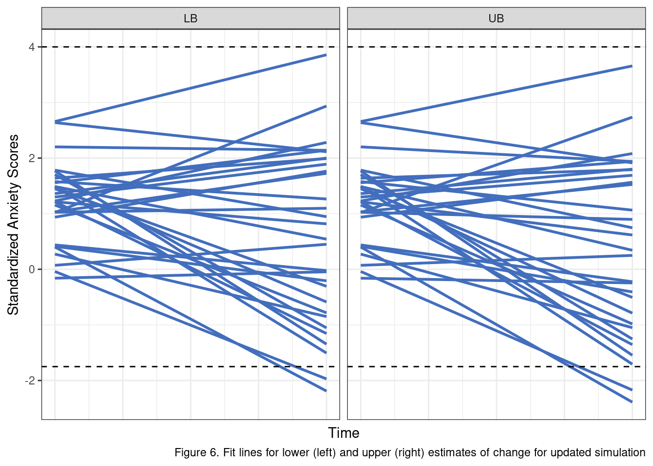
Putting It All Together
To pull this off, we are going to need a set of functions that generates multiple simulated data sets, applies our proposed model to each, and then stores the output in a list or data.frame for subsequent use. In short, we need more helper functions.
First, let’s build out the linear model portion of the data generation process.
generate_linear_model_posteriors <- function(intercept, time_points, delta, sigma_e, sigma_delta) {

  sim_df <- data.frame()

  for(n in 1:length(intercept)) {
    e_ti <- rnorm(length(time_points), sd = sigma_e)
    r_1i <- rnorm(1, sd = sigma_r1)

    y_obs <- intercept[n] + (delta + r_1i) * time_points + e_ti

    tmp_df <- data.frame(
      anx_scores = y_obs,
      time = time_points,
      id = n
    )

    sim_df <- rbind(sim_df, tmp_df)
  }

  return(sim_df)
}
Again, following my rule of make it work first, optimize second, I see a couple of opportunities here to make this function a bit more flexible and potentially drop the need for the for loop altogether. We are going to live with this for now, as it solves the present problem.
Next, we need to wrap everything in a function that can do all the heavy lifting of creating the simulated data. Basically, this thing needs to be able to take in some settings and a parameter that defines the number of desired simulations and spit out a bunch of randomly created samples according to our rules.
generate_sim_data_list <- function(simulation_settings, n_sims) {
  sim_results <- list()
  upper_tail_args <- simulation_settings[c('mu', 'sd', 'n', 'cut_point', 'rel_est')]
  linear_args <- simulation_settings[c('time_points', 'delta', 'sigma_e', 'sigma_delta')]

  for(s in 1:n_sims) {
    pi_0i <- do.call(generate_upper_tail_sample, upper_tail_args)[['y']] %>%
      unlist()

    sim_results[[s]] <- do.call(generate_linear_model_posteriors, c(list(intercept = pi_0i), linear_args))
  }

  return(sim_results)
}
Pheww… okay one last component we need to build out. We need a function that can model each data set. I am going to use the lme4 package for the modeling step. If you are interested in multilevel models and, probably, their most popular implementation in R you can learn more by reading the lme4 documentation.
To make this work we’ll need to specify the formula using the package’s syntax rules. The terms we expect to have “random” or individual effects are included in the ( 1 + time | id) portion of the formula.
base_formula <- 'anx_scores ~ 1 + time + (1 + time | id)'

generate_lmer_estimates <- function(df, form) {
  res <- lmerTest::lmer(form, df)

  res_table <- coef(summary(res))
  colnames(res_table) <- c('beta', 'se', 'df', 't', 'p')

  return(res_table)
}
This may seem like a lot of leg work, and it is. Honestly, there should be even more done for a final, polished product. For instance, I would recommend adding unit tests for each helper function. I would also suggest adding docstrings that explain each of the parameters so future me is not totally confused when I look at this code again in three months.
What this legwork buys us though is a great deal of flexibility at the critical point of this analysis. I am now able to parameterize all of the relevant model settings we walked through above. I have also broken down the simulation into the simplest stages possible:
- Define the settings
- Generate the simulation data
- Model the data and store the results
# For my overall settings
simulation_settings <- list(
  mu = 0,
  sd = 1,
  n = 120,
  cut_point = 1,
  rel_est = .775,
  time_points = 0:2,
  delta = -.05,
  sigma_e = .33,
  sigma_delta = .67
)

N_SIMS <- 1000
sim_df_list <- generate_sim_data_list(simulation_settings, N_SIMS)
sim_model_res <- lapply(sim_df_list, generate_lmer_estimates, form = base_formula)
We’ll operationalize power in this case as the probability of detecting a statistically significant effect, using the standard, but totally arbitrary \(\alpha = .05\) as our significance threshold. We used the lmerTest wrapper to generate an approximation of the degrees of freedom for each set of model estimates. It is not unreasonable given the fact that this is a power analysis for a intervention study, that we take a “one-tailed” approach to evaluating statistical power. Essentially, we are saying that we do not really care about our ability to reliably detect positive change in anxiety symptoms.
Before we move to the actual “power” part of the power analysis though, we should check to ensure that our simulated data returns model estimates that reflect our expectations. For instance, regardless of whether the models identify statistically significant change, we should expect that our \(\beta_{10}\), when averaged across all models is very close to what we set it to initially. Ensuring the model can correctly recover the simulated values is an important testing step in this process. We can’t have much faith in our ultimate analysis if there is a bug in our code somewhere or we have mis-specified the data generation process.
beta_10_vals <- lapply(
  sim_model_res,
  function(x) x['time', 'beta']
) %>% unlist()

ggplot() +
  geom_histogram(aes(x = beta_10_vals), fill = '#426EBD', bins = 20) +
  geom_vline(xintercept = mean(beta_10_vals), lty = 'dashed') +
  annotate('text', x = 0, y = 25, label = paste('Mean = ', round(mean(beta_10_vals), 3))) +
  labs(x = expression(~beta[1][0]),
       y = 'Frequency',
       caption = 'Figure 7. Verification of successful parameter recovery from simulation') +
theme_bw() 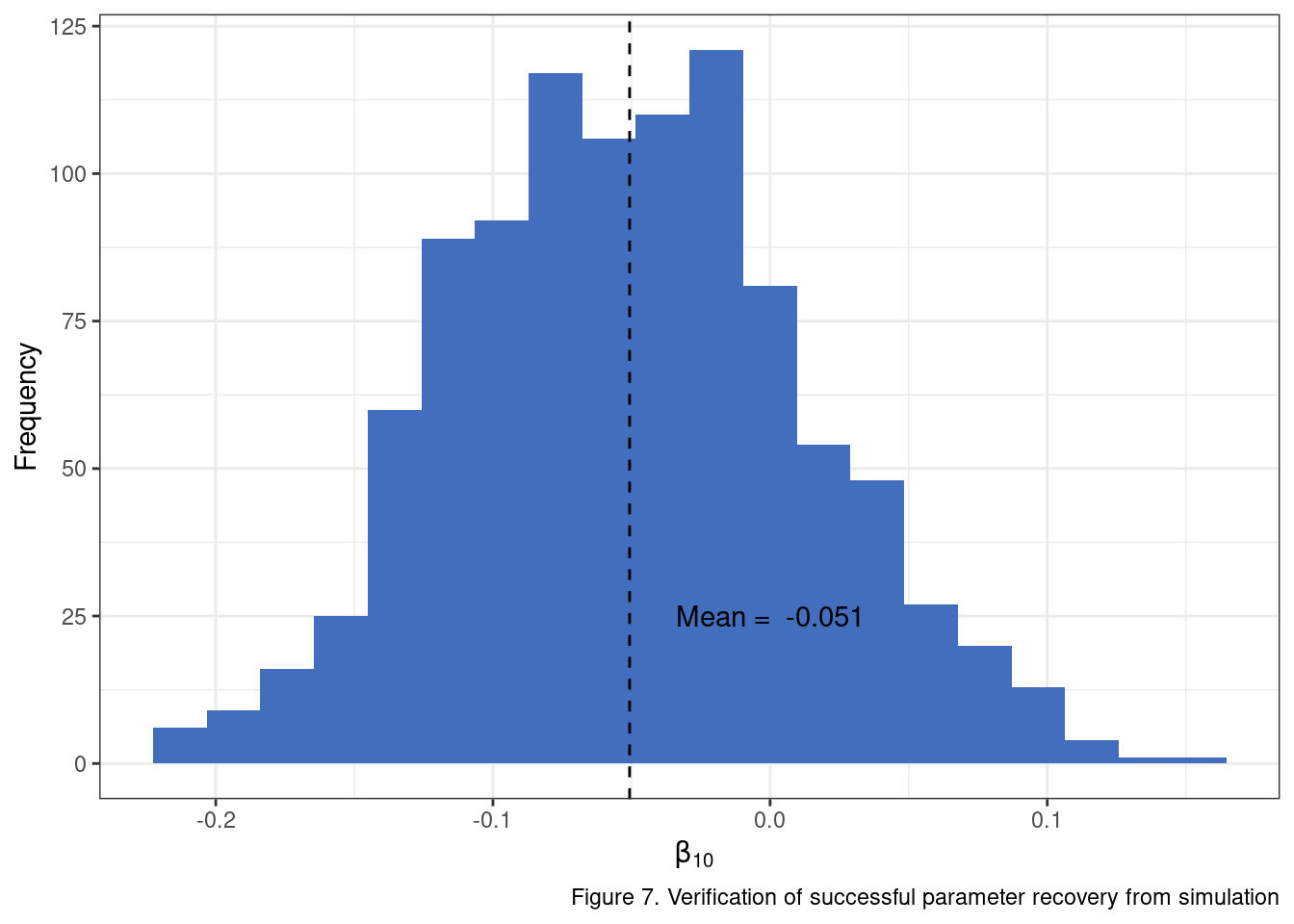
You can repeat the same exercise for additional parameters and see that the simulation setup is generating data in line with expectations. Woohoo! Now we can take the model results and extract the one-tail \(p\) values using the \(t\) statistic and estimated degrees of freedom.
# Use the estimated t value and degrees of freedom from each model's output
one_tail_p_vals <- lapply(
  sim_model_res,
  function(x) pt(x['time', 't'], x['time', 'df'], lower.tail = TRUE)
) %>% unlist()

# The proportion of models that would return significant estimates of change
mean(one_tail_p_vals <.05)
## [1] 0.199This is our first estimate of statistical power to this point. It is telling us quite plainly that we’ll have a pretty low chance of detecting significant change in our model when the “true” net change is only about .10 standardized units. What about our upper bound of .30 for the change estimate?
In fact, let’s go ahead and run the analysis using a range of plausible values for average change. In doing so, we are going to find our first efficiency bottleneck. It is not an unreasonable place to get clogged up computationally as we are essentially running 10,000 separate models on 10,000 separate data sets. I am going to push through the bottleneck using doParallel, but the better option would be to go back through the implementation and find opportunities to pull out for loops wherever possible and replace with vectorized operations.
delta_values <- seq(-.25, -.01, length.out = 10)

library(doParallel)
cl <- makeCluster(10)
registerDoParallel(cl)

p_sig <- foreach(i = delta_values, .export = c('generate_sim_data_list', 'generate_lmer_estimates'),
                 .packages = c('tidyverse', 'lme4', 'lmerTest'), .combine = c) %dopar% {
                   simulation_settings <- list(
                     mu = 0,
                     sd = 1,
                     n = 120,
                     cut_point = 1,
                     rel_est = .775,
                     time_points = 0:2,
                     delta = i,
                     sigma_e = .33,
                     sigma_delta = .67
                   )

                   N_SIMS <- 1000
                   sim_df_list <- generate_sim_data_list(simulation_settings, N_SIMS)
                   sim_model_res <- lapply(sim_df_list, generate_lmer_estimates, form = base_formula)

                   # obtain the proportion of
                   obs_sig <- lapply(
                     sim_model_res,
                     function(x) pt(x['time', 't'], x['time', 'df'], lower.tail = TRUE)
                   ) %>%
                     unlist()

                   mean(obs_sig < .05)

                 }

stopCluster(cl)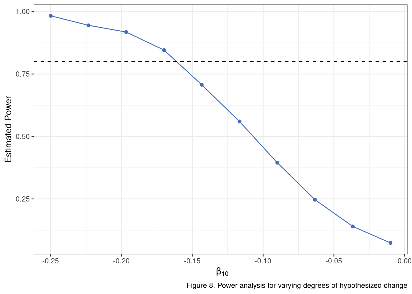
To return to our problem statement at the top:
Determine whether, given what we know about the target phenomenon, a sample of 120 subjects, measured at three time points is sufficient to detect linear change in an unconditional growth model.
We have a reasonable answer, after all of this work. Provided that we believe a likely estimate of the total change from baseline to the final post-intervention assessment is about .30 (\(\beta_{10} = .15\)) to .35 (\(\beta_{10} = .175\)) standardized units, then a sample size of 120 may be sufficient. If the expected change is less than that, the analysis will likely be under-powered. That is it… dozens of lines of code and many tweaks to distributions later we arrive at a two sentence conclusion that will receive cursory review by a grant panel. Ah, the quiet glory that is statistics.
Summary
Hopefully, you are at least convinced by this relatively simple example that statistical power analyses can be wiggly problems to pin down. There were a lot of moving parts to answer what seems like a simple opening question. You may be asking where is the R package that does all of this for me? Believe me I get it, and there are some good ones to be sure. For complex models, I like simr and simsem. Expect to spend some time learning how to specify the data generation process you want using these approaches. Read the documentation carefully so you can understand some of the decisions that have been made under the hood and whether they have implications for your particular analysis.
There is so much more ground to cover than what is reviewed here. With this model alone, we might actually want to include some additional properties. For instance, a common phenomenon is that individual intercepts are often negatively correlated with individual slopes in these sorts of growth models. The idea is that individuals with higher scores at baseline have less room to move up and more room to move down in terms of the post-intervention scores. We can add a component to our simulation that would account for the correlation between these two sets of individual-level effects. We may also want to incorporate missing data. For instance, we could drop certain values in the simulated data sets using a set of rules or criteria we expect might be at play (e.g., maybe individuals with higher baseline scores are less likely to complete the intervention). Building our own simulation engine here allows us to step in, modify, and tweak things like these as we go. We get more freedom and transparency, but the price is that we can’t just run library(cool_power_package) followed by nifty_power_analysis_function().